UX/UI Mistakes That Are Quietly Lowering Your Site's Conversion Rate
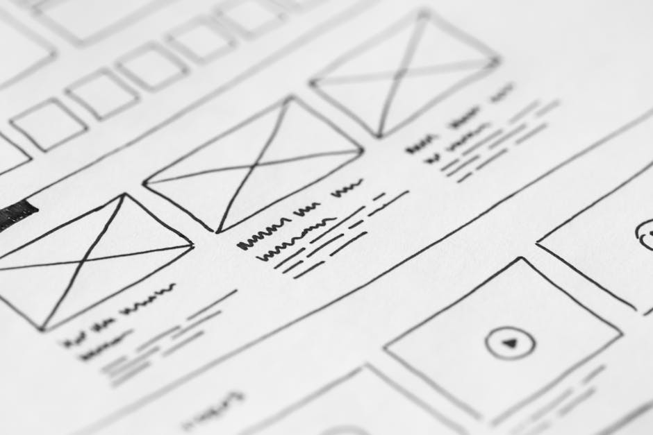
Your site gets traffic, it looks professional at first glance, and yet inquiries aren’t coming in at the pace you expected. It’s easy to assume the problem is traffic itself: you need more visits, more ads, more SEO. But often the problem isn’t how many people arrive, it’s what happens to them once they’re there. We already talked about why UX/UI design matters for conversion; this time we’re getting specific: the exact mistakes we see most often, one by one.
The button that doesn’t look like a button
A button that uses the same color as the rest of the page, with no border, no shadow, no contrast, doesn’t register as “something you can click.” The visitor scans it as decorative text and moves on. The test is simple: if you had to explain to someone over the phone “it’s the green button, top right” and you can’t, because there’s nothing green and nothing at the top right that stands out, that button needs more contrast.
Forms that ask for too much, too soon
Asking for name, phone, company, budget, and message on the first contact form is asking a stranger to commit before they trust you. Every extra field is one more reason to abandon. The forms that convert best ask for the bare minimum needed to take the first step (a name and one way to reach them) and leave the rest for the actual conversation.
Copy that describes the business instead of answering the visitor’s question
“We’re a company with years of experience committed to excellence” doesn’t answer any question anyone is actually asking. When someone lands on your site, they’re carrying a specific question in their head: “does this solve my problem?”, “roughly how much does this cost?”, “can I trust this company?” If your page copy doesn’t directly answer any of those questions in the first few seconds, the prettiest design in the world won’t make up for it.
Navigation that forces people to think
Menus with more than seven options, ambiguous section names (“Solutions”, “About+”), or different paths that lead to the same place confuse more than they help. The practical rule: someone who’s never seen your site should be able to guess, without clicking, where each menu option will take them. If a section name needs explaining, it probably needs changing.
Everything competing for attention at once
When a banner, a pop-up, three different “action” buttons, and a floating chat widget all show up on the same screen together, none of them win. The visitor ignores everything or leaves. A page with one clear priority action converts better than one trying to grab attention five different ways at once.
How to spot these mistakes on your own site
You don’t need a full usability study to get started:
- Ask someone who doesn’t know your business to open your site on their phone and try to find the price or how to contact you. Time how long it takes and where they get stuck.
- Watch a real session recording (tools like Hotjar or Microsoft Clarity are free at low volume) and notice where people click and nothing happens, or where they stall and don’t move forward.
- Review your own contact form from scratch, as if you were a new customer. Count how many fields there are and ask yourself if you really need all of them before the first conversation.
None of these mistakes is dramatic on its own. The problem is they tend to show up combined, and each one chips away a little more trust from the visitor until they decide it’s not worth the effort to stay.
Have a project in mind?
Tell us what you need in a free 30-minute strategy session, no commitment.
Start a project →Cover photo: picjumbo.com / Pexels
Keep reading
 Digital Presence & Websites
 Free Website Speed Audit: What We Check and What We Almost Always Find
What a real website speed audit includes, and the most common problems we find on SMB sites.
May 2026 Digital Presence & Websites
 How to Read Your Website Speed Audit Report Without Being a Developer
A guide to understanding the terms, scores, and recommendations in a website speed report, no technical background required.
July 2026 Digital Presence & Websites
 How Much Does a Custom Website Cost in 2026? A Pricing Guide for SMBs
Real price ranges for web development, what moves them up or down, and the red flags to watch for when comparing quotes.
January 2026